BearingsBuilding the design system for a group road-trip planner.
- Role
- Product Designer
- Team
- 4 designers + a lead
- Timeline
- 5 weeks
- Recognition
- Audience Choice Award
- Year
- 2026
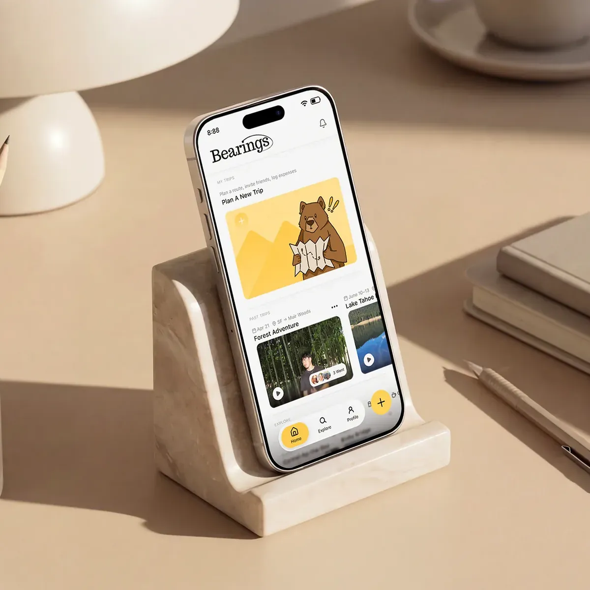
Bearings is a group road-trip planner for iOS. It turns trip planning from a one-person job into something the whole group shapes together, from the first idea to the final route.
I led the visual design and built the system four designers worked from.
- ConceptProposed making Bearings group-focused early on, which sharpened what the product was for.
- ResearchWrote the interview questions the team took into user sessions.
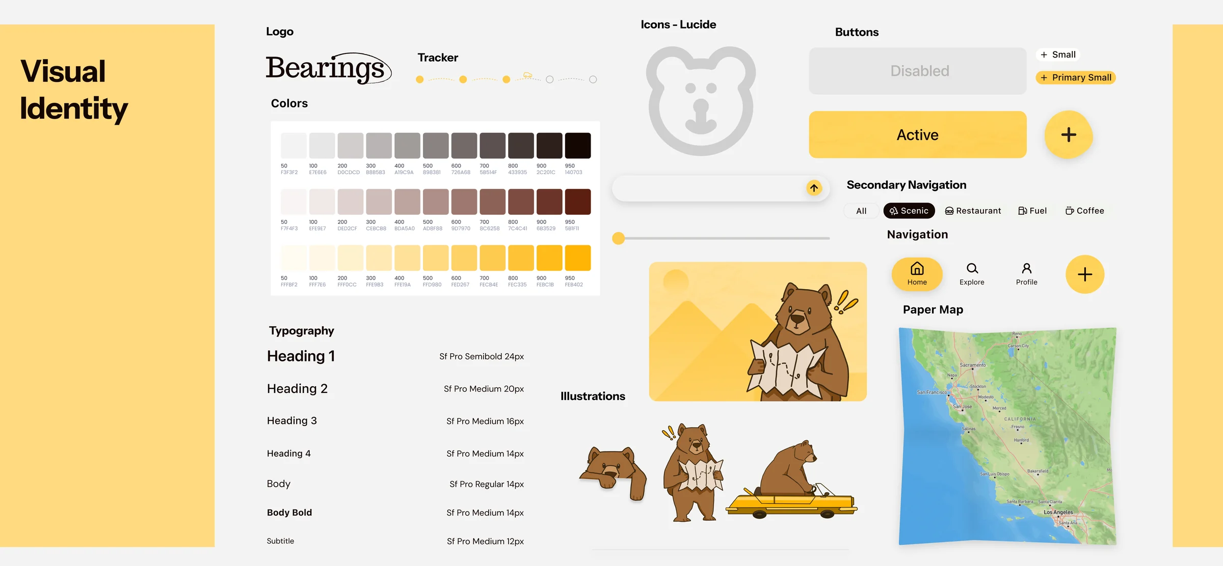
- Design systemThe logo, the type and spacing, and a shared component library, so four designers could ship one product instead of four.
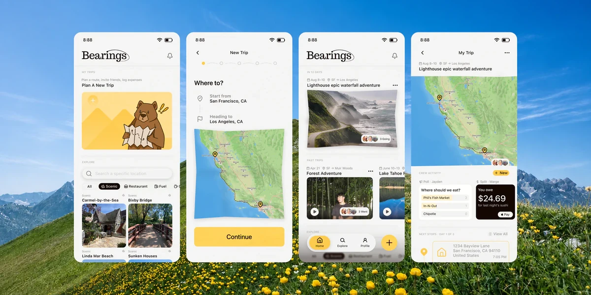
- ScreensOnboarding, the home page, building a trip, and the My Trips hub.
- ResearchInterviews and a survey of how groups plan a trip. 90% of the people surveyed plan as a group.
- ConceptRoadie and Google Maps both assume a single planner, so the group itself became the product.
- SolutionThe group and the trip merged into one shared hub instead of two screens.
- OutcomePitched to a panel of industry judges. Audience Choice.
Road trips are fun. Planning them isn't.
Everything before the drive lands on one person, spread across a group chat, a budget note, and a dozen open tabs.
18hoursis what the average American spends planning a single trip, scattered across tools never built to work together. Talker Research, 2024
Every tool left the group out.
Roadtrippers, Roadie and Google Maps are great at routes, but each assumes a single planner on a single path, so we surveyed and interviewed road trippers. 90% of the people we surveyed plan their trips as a group, and the friend who always ends up planning told us the hard part was never the route or the budget. It was getting everyone else to care. Testing as we went, people kept looking for their group and their trip on the same screen, so we merged the two into a single shared hub.Bearings survey · 42 road trippers
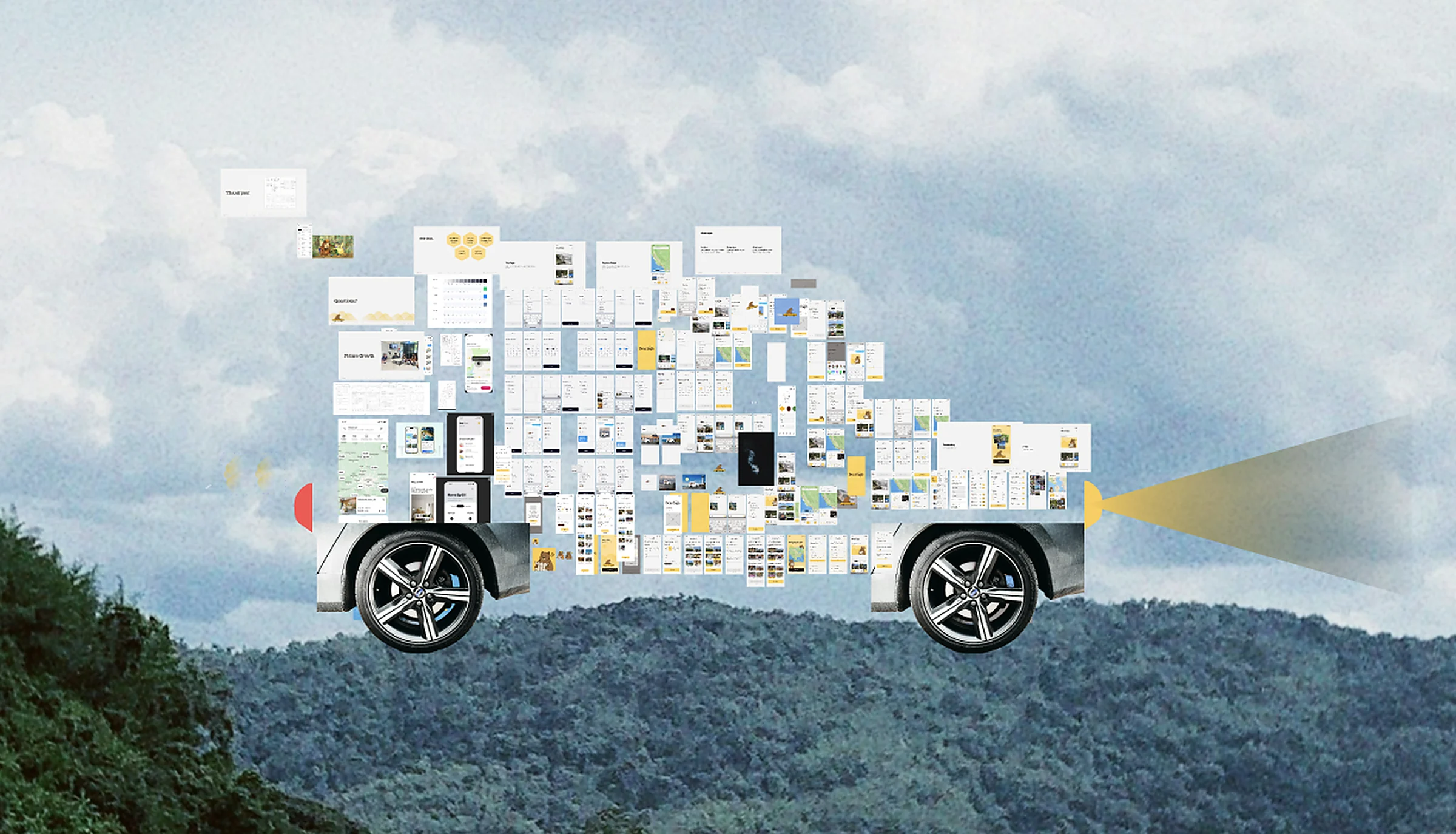
So we built one for the whole crew.
The hardest part was never the screens, it was us: four designers whose instinct was to add everything. I pushed us toward the flows that mattered, and when our design lead stepped away I started running the discussions.
The best calls were the ones to cut. I fell hard for a paper-collage direction, then scrapped it, characters and all, when the app tipped childlike instead of premium. Drop shadows went the same way once testing kept calling them tacky. A Spotify-Wrapped-style recap lost to the flows that make the app work.


The feeling comes before the form.
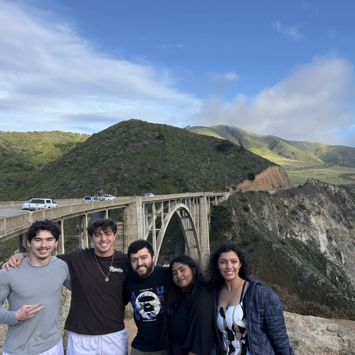
Instead of a form, I opened on real photos of friends on real road trips under one line, Roadtrips Made Together, then asked a few quick questions one at a time. Account creation moved to the very end on purpose.
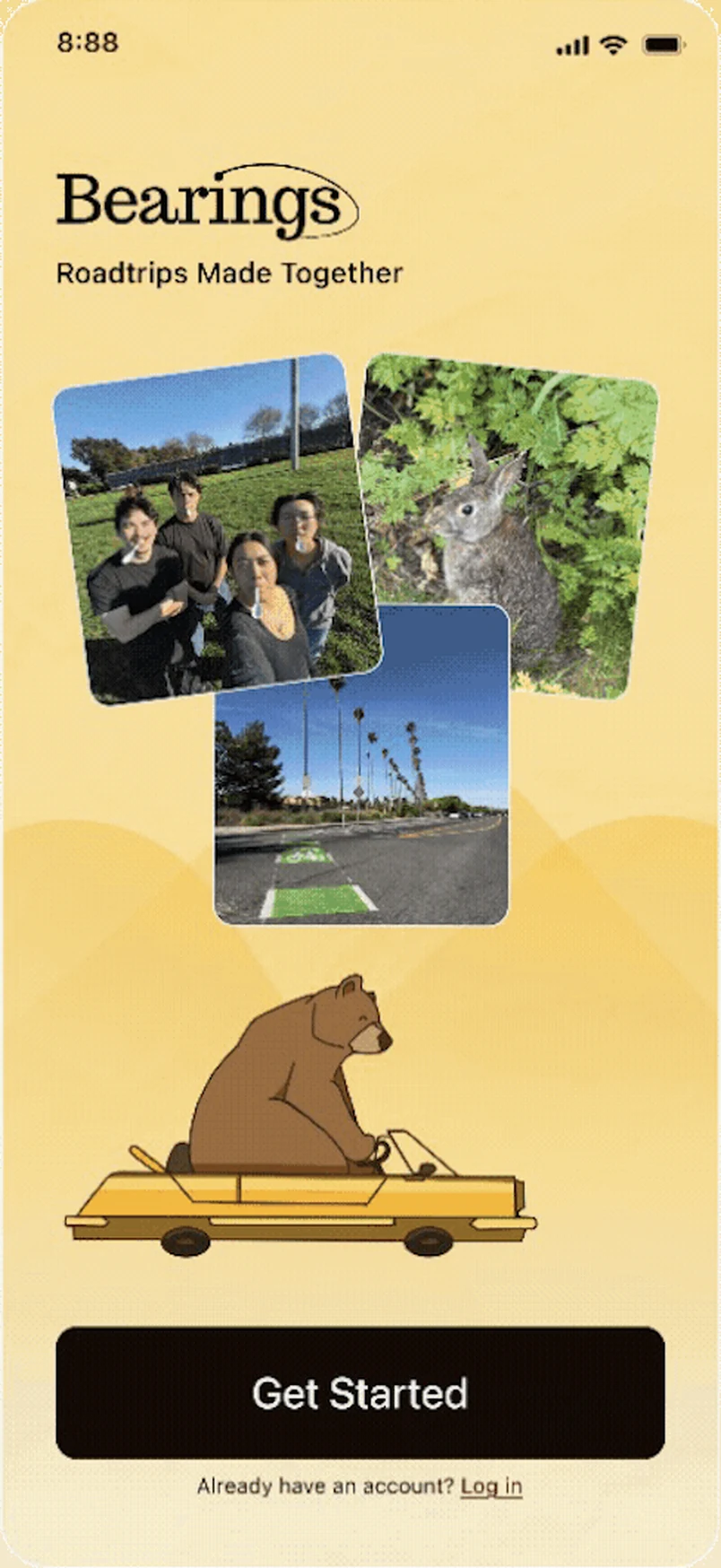
WelcomeGet started, then allow location so nearby stops surface.
Five steps against eighteen hours.
I collapsed planning into five clear steps around a paper map, playful but premium, so it feels like part of the trip instead of a chore. The route sits up top, and below it are the things groups actually fight over: where to eat becomes a quick poll, the bill splits itself as you go, and the itinerary bends the second plans change.
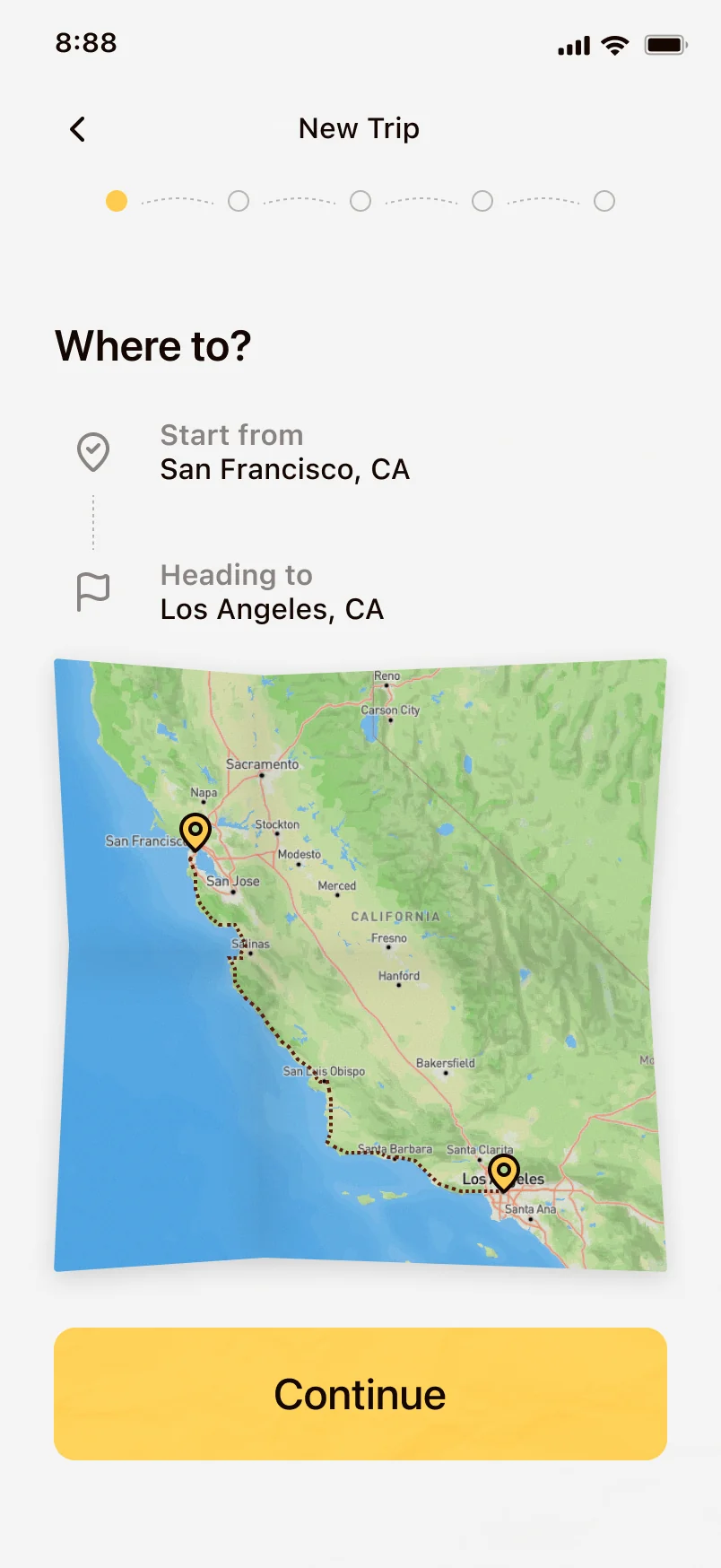
Step 1 · Where to?Start and end. Two fields, no tabs.
Road trips are fun. Now the planning is too.
Bearings took the Audience Choice Award at our showcase, and judges from LinkedIn and ServiceNow singled out its brand identity. It hasn’t shipped, so the numbers are still the first things I’d instrument: planning time falling from eighteen hours toward minutes, and the whole group contributing instead of one person.