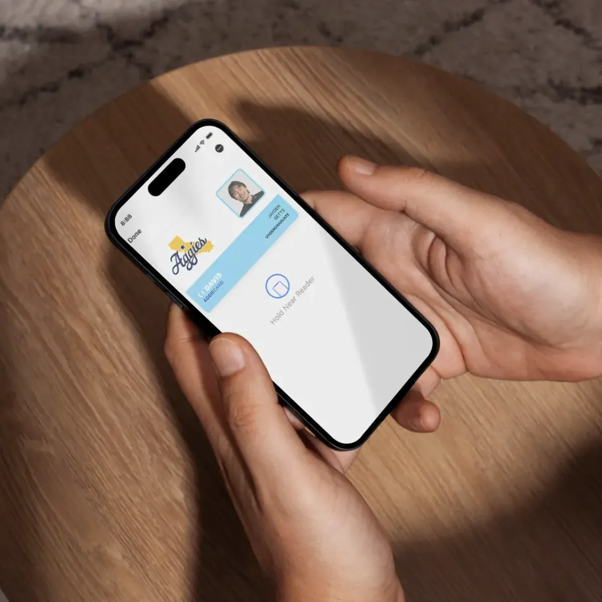
UC Davis RecPutting the gym ID in Apple Wallet, and killing the login.
- Role
- Product designer
- Team
- Solo designer
- Timeline
- 3 days
- Key idea
- Member ID in Apple Wallet
- Year
- 2026
The UC Davis Recreation app should be the easiest way into the gym; I use it, and it frustrated me. Over three days I rebuilt it around the one thing students open it for, and moved the gym ID into Apple Wallet.
I rebuilt the app in three days around the one thing students open it for.
- ResearchRan three student interviews and found everyone opened the app for the same single task.
- Product thinkingCut the app down to that one task instead of defending a grid of buttons most people never press.
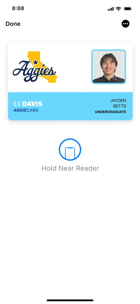
- InteractionMoved the Member ID into Apple Wallet and removed the login standing in front of it.
- OutcomeThe work earned an interview and a place in the Design Interactive cohort.
- ResearchThree interviews with students who already use the app.
- FindingEveryone opened it for one thing: scanning into the ARC.
- RedesignThe home screen rebuilt around that one task, not a grid of equally weighted icons.
- Shipped asA concept, made unsolicited over a weekend and sent in anyway.
The app was a barrier, not a tool.
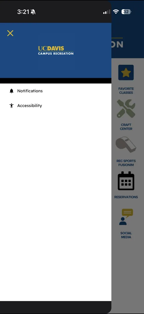
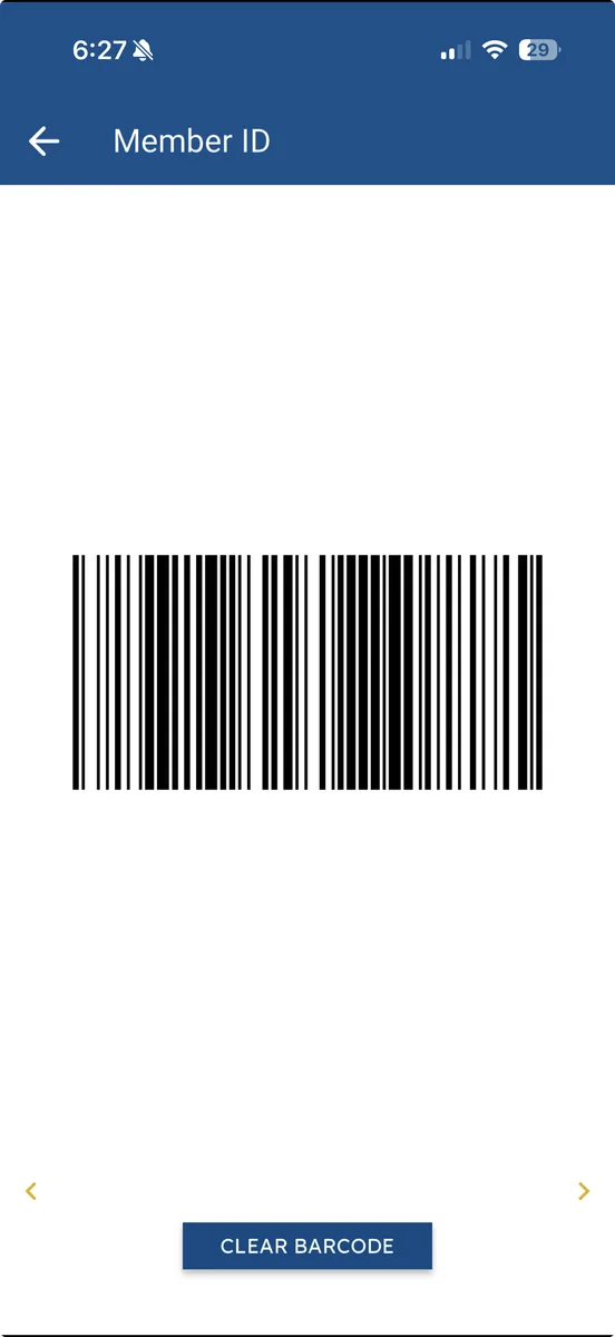
The login stands between you and the ID that gets you through the gym door, and the rest is identical icons with no hierarchy. UC Davis wants a hub for campus life; it acts like a turnstile.
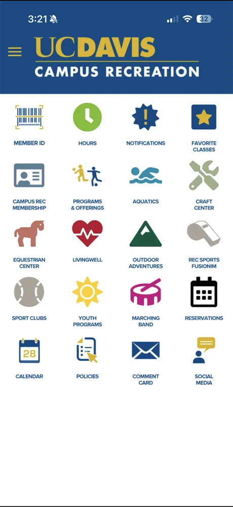
Students only opened it to scan in.
I ran three interviews with students who use the app, and the pattern was immediate: everyone used it for one thing, scanning into the ARC. The friction hid everything else UC Rec offers.
“It’s kinda confusing to navigate, sometimes it takes me a while scrolling through it.”Student, 2nd year

“I just use the app for scanning into the ARC when I don’t have my card.”Student, 3rd year

“I only use it to scan in. It could use a format change.”Student, 1st year

Built around what students actually use.
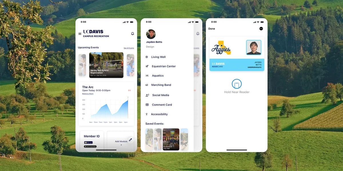
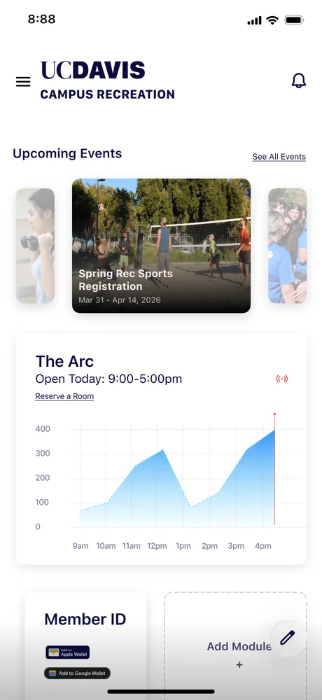
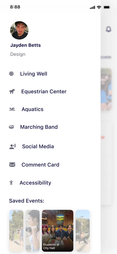
I rebuilt the home screen around a clear hierarchy and modules students cater to themselves, instead of a grid of buttons most will never press. Live gym capacity was easy to add, since everyone already scans in, and the tabs no one used move into a side menu.
The gym ID lives in Apple Wallet.
Instead of logging in every time, I moved the Member ID into Apple Wallet. Hold your phone near the reader and you’re in, as fast as Apple Pay. No login to fight, no password for the app to store.
92%of people would abandon an app rather than reset a forgotten password. Transmit Security, 2025
Three days of design opened a door.
Three days forced me to prioritize: kill the login friction rather than polish every deep screen. With more time I’d design the Aquatics and Equestrian screens and pitch the ARC on making the Wallet integration real.
I submitted it to the Design Interactive cohort on campus. It landed me an interview, and a spot in the program, where I went on to design Bearings.